|
Design a Creative Alphabet In Pixlr, Sumo or Photoshop, create a font using cut/copied and pasted pieces of digital photo images. Each letter must be designed using two or more objects (or pieces of objects) taken from different photos. You can use a single photo more than once for any single letter, but you need to use at least two different photos for each letter and you may not use the same photo for more than one letter. Create an uppercase and lowercase version of each letter. See the example below. I suggest creating a workspace measuring approximately 2400 (width) x 1200 (height) pixels in which to assemble and layout your alphabet. 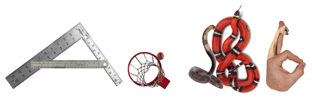 Assignment #1 "Strange Birds..."
Assignment #2 "Digital Coloring" Assignment #3 "Gone Without a Trace" Assignment #4 "A-maze-ing Work"  OK, so before you get into this assignment, let me advise you that at the very bottom of this post is a link to a tutorial I put up on our YouTube channel that will be EXTREMELY HELPFUL to you as you complete this assignment. PLEASE, take the time to watch it. Using your VERY BEST Photo Compositing skills, create an image of an imaginary animal doing something that is a uniquely HUMAN activity (something only people, among all other animals, do) in an unusual place. REQUIREMENTS: 1. Your imaginary animal will be created from images of bits and pieces of four (4) other animals. 2. Your animal will be placed into a background image that is separate from any of the other images you use. 3. Any other objects you put into your own composition (project) must come from images that are separate from any other images you use. 4. DO NOT use .png files or any other type of image that has a transparent or flat, single-colored background. SAVE ALL OF THE IMAGES YOU USE AS FILES THAT ARE SEPARATE FROM YOUR PROJECT. You will have to turn in your project AS WELL AS all of the original images. The image above is my finished project (teacher example). The image below is one in which I combined all of my "source photos'. Other Stuff: - Use images that have a pixel value higher than 1000 for the larger size. For example, let's say you find a photo in Google that you want to use. Underneath the photo will be numbers that represent the the number of pixels that the image is made of. If that photo has a pixel count of 232 x 312 (for instance), then it is a pretty low quality image. Don't use it. Choose another image with it's larger number being over 1000... let's say 800 x 1340. The background image should have a larger number above 1800 pixels. - For helpful hints and tips on photo compositing and digital painting (which you will have to do for this project), go to the YouTube channel. In YouTube, search "JLCP Art". Check the tutorials. They will be very helpful. The tutorial on Digital Painting (which is something you're going to need to do for this project) can be found at: https://www.youtube.com/watch?v=gC9oS_gh0SY If the link doesn't take you directly to the video, copy and paste the address in the address bar of your browser. 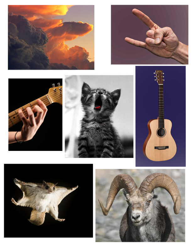 In Inkscape, draw an extremely difficult and detailed maze. Start by using the Pencil Tool to draw with. Look under the commands in the top command bar (the ones with the dropdown menus) and click on "View Grid". The grid will make drawing this thing a lot easier. Use the "Copy" and "Paste" and/or "Duplicate" commands (or any other tricks you know or can figure out) to make your life easie  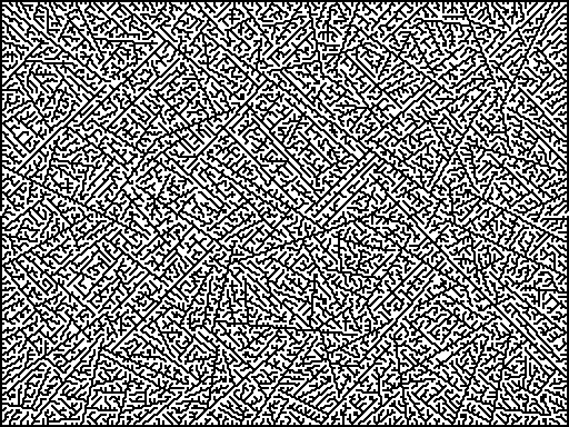 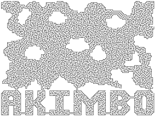 Choose an image of an outline drawing... similar to the ones that we used for Assignment #2 "Digital Coloring", but a picture of anything you like.
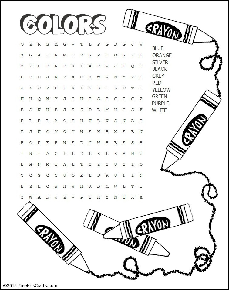
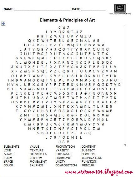
Using Pixlr, color it any way you like using (So don't worry about what colors are next to other colors). This project will count as extra credit that you can apply to any of your project grades. SO, have fun with it! Choose the appropriate Word Search puzzle by following the link for it below. You may work by yourself OR you may work with ONE partner. Save the puzzle just like you would save any other image file. Then open it in Pixlr and complete it by drawing lines around the words just like if you were completing it by hand with a pencil or pen. Save it to your Desktop when you are done you. Make sure you write your name (or names) and period on it. I you're working by yourself, use the puzzle at: https://www.freekidscrafts.com/wp-content/uploads/COLORS1.jpg If you're working with a partner, use the puzzle at: http://4.bp.blogspot.com/-KtJ0nJookXk/UhJfLWw9wEI/AAAAAAAAM1g/vvoXj9k4ywA/s1600/Untitled3.jpg Below is an example of how to mark the words. Use any color, brush size or tool you like. Just make sure I can read it. 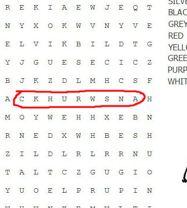 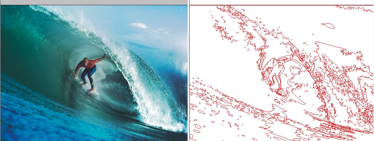 Select a full color photo (not cartoon, but a photo of something from real-life) from the internet. IMPORT that photo into Inkscape. Using the pencil tool, create a line drawing by tracing the majority of the shapes in the photo, meaning the shapes you can clearly see. The photograph you use to trace must be at least 1000 px on the long side of the photo (ex. 898 px x 1200 px.) Using a higher resolution photograph will make your job much easier. Make your line 1 pixel (px) wide. Use a bold, bright line color. It makes keeping track of what shapes you have already traced a lot easier. You can set up your line width and color before you start so that you don't have to change it at all as you're drawing (known as "Default Setting"). Instructions for setting the line default color and width are below. Save the traced drawing AND the original image and be prepared to turn in both. Oh, and do good work! :) Also... Very Important! AS you're working on this, make sure to save your work in INKSCAPE as an .svg file. You will need to come back to it each day to work on it. You will need all of your objects to remain editable. When you are done, you will delete the photo from the drawing so that only the lines you've drawn remain. When you are finished, that final drawing must be saved as a .png file. YOUR WORK WILL BE GRADED BASED UPON: 1 THE COMPLEXITY OF YOUR TRACING. FOR YOUR WORK TO BE CONSIDERED OF "A" QUALITY, THERE SHOULD BE A MINIMUM OF 200 INDIVIDUAL SHAPES DRAWN. 2 THE QUALITY OF YOUR TRACING. WHEN EXAMINED CLOSELY, THE TRACED SHAPES IN YOUR DRAWING SHOULD BE DRAWN WITH CARE. AND WHILE NOT PERFECT, THOSE TRACED SHAPES SHOULD BE PRETTY CLOSE TO THE ORIGINAL SHAPES IN THE PHOTO. PLEASE HAVE A LOOK AT MY EXAMPLE BELOW. I WOULD CONSIDER THOSE SHAPES TO HAVE BEEN DRAWN WITH GREAT CARE.  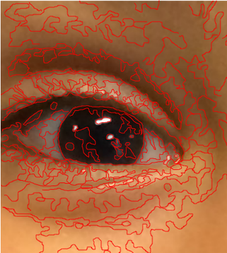 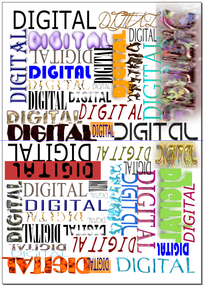 ADJUSTING DEFAULT SETTINGS FOR THE PENCIL TOOL:
1 CLICK THE PENCIL TOOL 2 DRAW A LINE BY PRESSING AND HOLDING THE MOUSE BUTTON WHILE MOVING THE MOUSE. IF YOU NEED TO DRAW A PERFECTLY STRAIGHT LINE, CLICK ONCE WITH THE MOUSE, MOVE THE MOUSE WITHOUT HOLDING DOWN THE BUTTON TO THE END OF THE LINE YOU'RE DRAWING AND THEN CLICK AGAIN 3 IN THE TOP MENU BAR, CLICK OBJECT. THEN CLICK FILL AND STROKE IN THE DROPDOWN MENU BELOW IT 4 IN THE FLYOUT MENU THAT APPEARS ON THE RIGHT SIDE OF THE SCREEN, THERE ARE THREE TABS: FILL, STROKE COLOR AND STROKE STYLE 5 FOR FILL, CLICK THE "X" FOR STROKE COLOR, SELECT A COLOR THAT WILL REALLY STAND OUT FROM THE COLORS IN YOUR PHOTO FOR STROKE STYLE, SET THE WIDTH TO 1 MM (THE LINE YOU'VE ALREADY DRAWN IN YOUR ONSCREEN WORKSPACE SHOULD NOW APPEAR AS A THIN LINE WITH THE COLOR YOU CHOSE) 6 CLICK EDIT IN THE TOP TOOLBAR 7 CLICK PREFERENCES 8 CLICK PENCIL UNDER THE LIST OF TOOLS 9 UNDER STYLE OF NEW OBJECTS CLICK LAST USED STYLE NOTE: FOR SOME REASON, FOLLOWING THE STEPS ABOVE SOMETIMES DOESN'T WORK. IF THIS HAPPENS, FOLLOW THE STEPS AGAIN... IT SHOULD WORK THE SECOND TIME  Follow the links below to view several examples of Cut Out Collage Animation. Your next project will be to create an animation in this style using Pencil 2d.
https://www.youtube.com/watch?v=I4eVkanDkgg https://www.youtube.com/watch?v=XAm4i1X7L_Y https://www.youtube.com/watch?v=my9YV7jdc34 https://www.youtube.com/watch?v=HYBFkPdvNlU 1 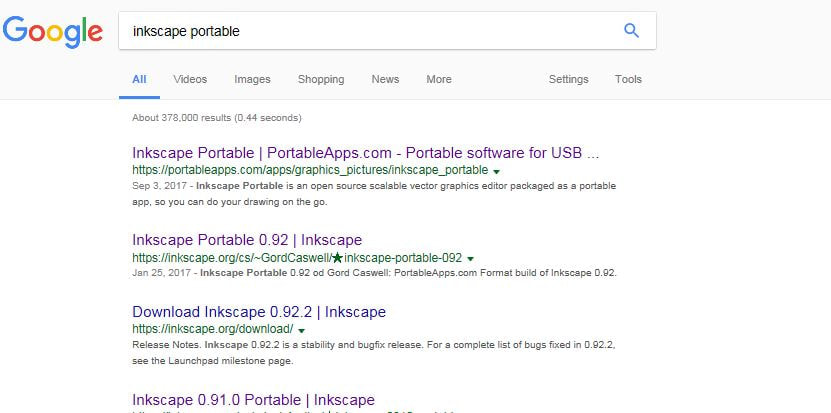 XXXXXXXXXXXXXXXXXXXXXXXXXXXXXXXXXXXXXXXXXXXXXXXXXXXXXXXXXXXXXXXXXXXXXXXXXXXXXXXXXXXXXXXXXXXXXXXXXXXXXXXXXXXXXXXXXXXXXXXXXXXXXXXX 2 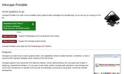 XXXXXXXXXXXXXXXXXXXXXXXXXXXXXXXXXXXXXXXXXXXXXXXXXXXXXXXXXXXXXXXXXXXXXXXXXXXXXXXXXXXXXXXXXXXXXXXXXXXXXXXXXXXXXXXXXXXXXXXXXXXXXXXX 3 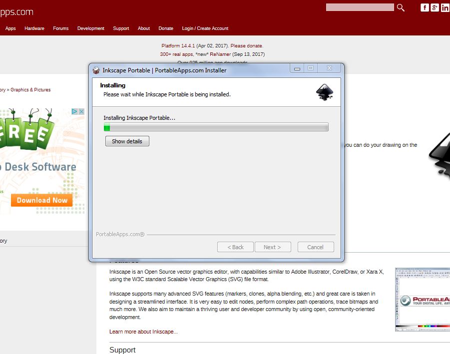 XXXXXXXXXXXXXXXXXXXXXXXXXXXXXXXXXXXXXXXXXXXXXXXXXXXXXXXXXXXXXXXXXXXXXXXXXXXXXXXXXXXXXXXXXXXXXXXXXXXXXXXXXXXXXXXXXXXXXXXXXXXXXXXX DIRECTIONS: 1. Google "Inkscape Portable" 2. Select "Inkscape Portable/PortableApps.com" 3. Click on "Download 0.92.2 Rev 2" 4. Click "Run" 5. Follow the instructions from there. 6. When prompted with "Destination Folder", select "Browse" and then "Desktop" 7. Follow instructions from there Directions: Copy, by hand, the following information word for word, verbatim, exactly...
If your soul is now screaming "But... whyyyyyyyyyyyyyyyy do I have to write it?" Please click the links below to find important research about writing stuff out by hand. https://www.huffingtonpost.com.au/2016/04/21/writing-by-hand-benefits_n_9735384.html https://www.medicaldaily.com/why-using-pen-and-paper-not-laptops-boosts-memory-writing-notes-helps-recall-concepts-ability-268770 https://www.psychologytoday.com/us/blog/memory-medic/201303/why-writing-hand-could-make-you-smarter (START COPYING HERE) The Elements of Design (a.k.a. “The Elements of Art”) The Basic “Building Blocks” of the Visual Arts (Don't worry about the different colors of the fonts. It doesn't mean anything. It's just for my own organizational purposes. Oh, and don't write this part in parentheses) I. Line: A continuous, moving mark made upon a surface. Line Types:
Line Directions:
II. Shape/Form: A shape is any flat, two-dimensional object. A form is any “round” three- dimensional object. Techniques for making a two-dimensional shape appear three-dimensional:
III. Space: Positive Space is the area occupied by an object in a composition. Negative Space is the empty or unused area in a composition. It is a very common mistake among students to leave too much Negative Space in their compositions. Note: Another type of space is the “illusion” of space that can be created in a composition when an artist creates a sense of depth by using different perspective methods. These methods include Linear Perspective, Atmospheric Perspective, Diminishing Scale, Overlapping and Placement in the Composition (Usually the higher an object is, the farther away it is.) IV. Value: Value describes how light or dark an object is.
V. Texture: “Actual” or “Real” Texture is an object’s touchable surface quality or “how it feels in real life”. “Simulated” or “Implied” Texture is an illusion created when an object’s apparent or observed texture is different from its Actual Texture. VI. Color: The visible light from an object. A. Color Families:
B. Non-Colors
C. Qualities of Color
VII. The Principles of Design (a.k.a "The Principles of Art") These are "The Rules" for creating a good composition using the Elements of Design 1. Harmony: Combining the Elements in a composition skillfully so that the different parts of the composition all work well together. 2. Variety: Creating changes in the way an Element is used in a composition. 3. Proportion: The way the size of an object relates to the sizes of other objects in a composition. 4. Gradation: Creating "soft" or gradual changes in the way an Element is used in a composition. 5. Movement: Creating a sense of action in a composition. 6. Balance: Creating a skillful distribution of objects in a composition, a skillful arrangement of "visual weight". 7. Emphasis: Drawing attention to a particular object or piece of a composition. |
AuthorDaniel P. Loughran is an artist and art educator who lives in Jacksonville Beach, Florida. Archives
September 2020
Categories |
 RSS Feed
