|
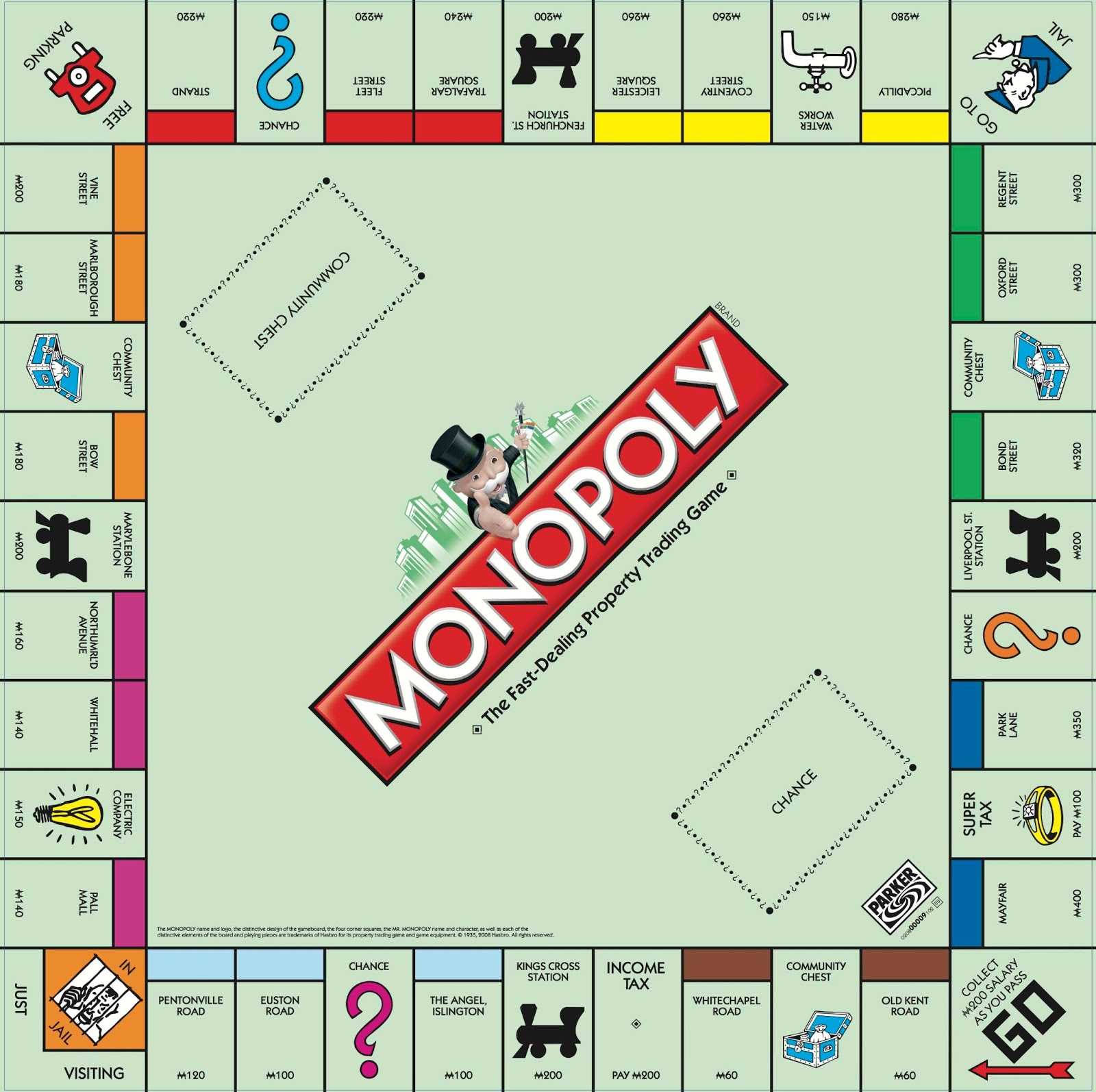
Using the link below (which provides an excellent high-resolution image of a standard Monopoly game board), redesign the game board so that it becomes "MONOPOLY JLCP SPECIAL EDITION". The theme of your new game will have something to do with Landon... the entire school or the academics, athletics, music, arts, etc. programs. Make sure that you change all of the spaces in some way. Change the colors and names. Do not copy directly from the example below. Make it your own... make it creative or funny or ironic, school-spirited... make it unique. The color scheme of your game board should in some way reflect our school colors (be as creative as you want with going beyond the traditional orange, black and white). Whatever colors you choose, make sure to change all the colors from the traditional original colors of Monopoly to new ones. My examples below are not meant to be the completed assignment, just a few ideas. Be as creative and/or funny as you can. Use Pixlr, Sumo, Gimp and/or Inkscape to do your work. And have fun with the assignment :-) High-Resolution Monopoly Game Board: https://static.wixstatic.com/media/a2776c_2421794722ac4620b5b9cf6e54ca363c~mv2_d_1600_1594_s_2.jpg 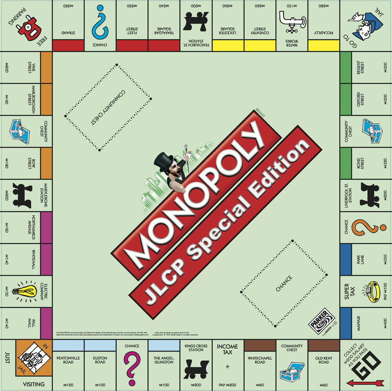 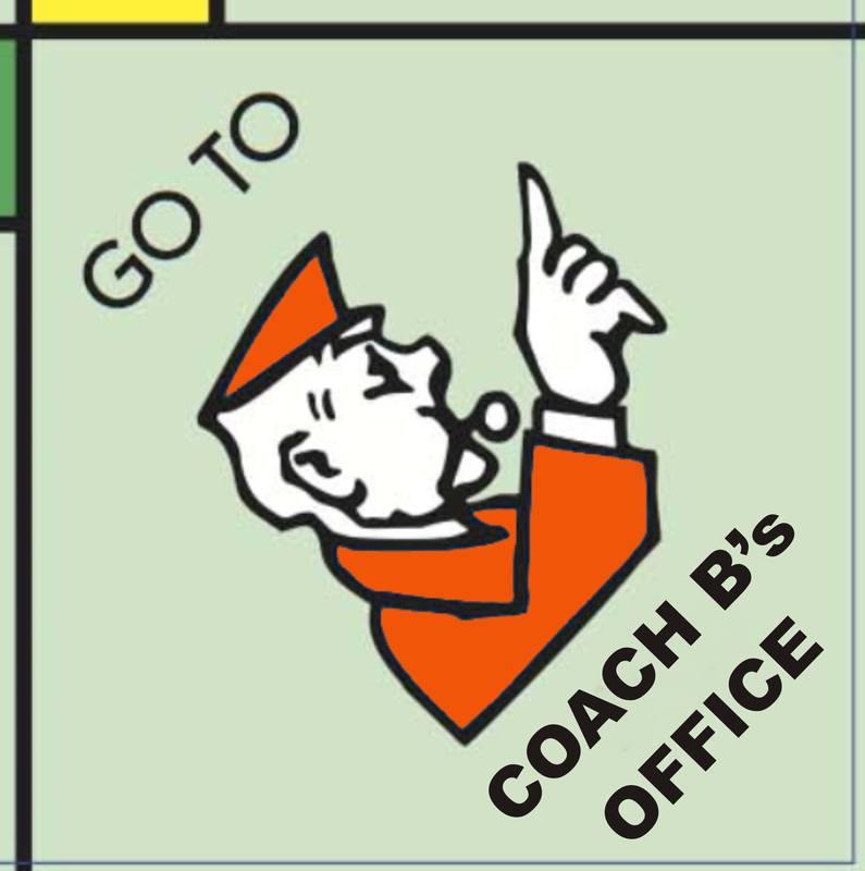 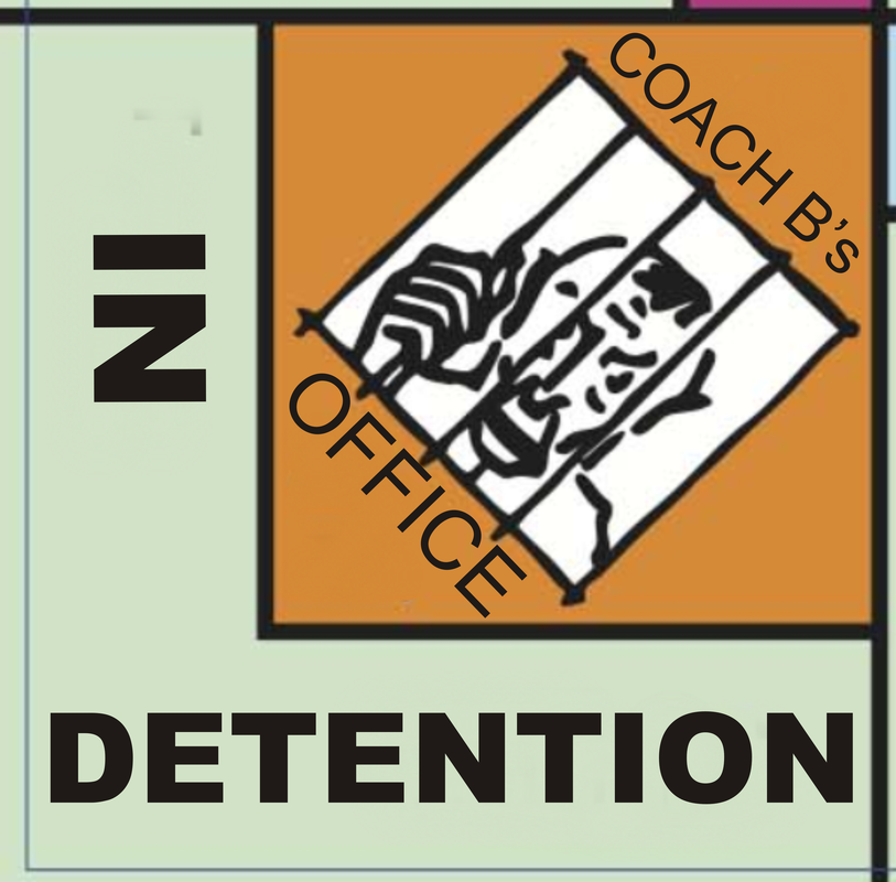 Students, please be aware of the following assignment due dates:
Assignments #10 and #11 Wednesday, December 12 Assignment #12 Friday, December 14 POLITICAL SATIRE IMAGE FAKE NEWS Using three or more images found online, create a national or international news event that never actually happened. The goal is to put together an image that looks as if it came right off the TV news. IT NEEDS TO BE CONVINCING, TO LOOK REAL. BUT THE IDEA IS TO CREATE THIS IMAGE TO LOOK SUPER-REAL WHILE AT THE SAME TIME BEING ABOUT A (RIDICULOUS/ABSURD/HILARIOUS) FICTITIOUS NEWS EVENT. Your composition should be put together in Pixlr and Inkscape... Pixlr for the photo editing, Inkscape for all of the text. GRADING CRITERIA ARE: 1. CREATIVITY OF THE FAKE NEWS EVENT 2. QUALITY OF THE PHOTO EDITING... (IT NEEDS TO LOOK CONVINCINGLY REAL) 3. QUALITY OF THE TEXT LAYOUT 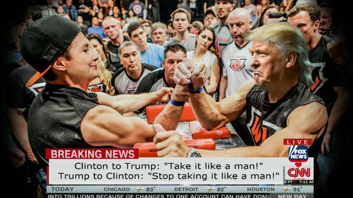  AS OF THE END OF THE SCHOOL DAY ON FRIDAY, DECEMBER 7, 2018, ALL GRADES ARE COMPLETELY CURRENT FOR DIGITAL ART 1 STUDENTS. If you have a grade of "0" in FOCUS for Assignment #8 (Alphabet) or Assignment #9 (Logos), then you have either not submitted the work or you have given me an IMPROPERLY FORMATTED FLASH DRIVE! If you have given me a flash drive with your work on it and still have a grade of "0" on either or both assignments (8 or 9), read the blog post before this one. SERIOUSLY! We go over this in class EVERY DAY! It's in several places on the blog. It's on the main board in class!!! AAAAARRRRGGGHHHHHHHH!!! If you still wish to submit either or both of these assignments for grading, the work will have to be printed out, in color, on regular-sized printer paper (8.5" x 11"), clearly labeled with NAME, DATE AND PERIOD in the bottom right corner of the front side of the page and given to me directly (you pass the work from your own hands to mine) NO LATER than Friday, December 14, 2018. If this is not done exactly as described above, your grade of "0" will BE CARVED IN STONE!!! Forgive me if I come across as a little annoyed here, but seriously... you'd have to be ignoring me on purpose by now if you're still not getting this right.  PLEASE, FOR THE LOVE OF ALL THAT IS GOOD IN THE UNIVERSE, READ THIS IF YOU WANT YOUR WORK GRADED.12/5/2018
There are still some students doing this wrong. So, in case you missed the instructions for submitting your work for grading (the first 37 times), please follow the directions below:  1. Start by inserting your flash drive in your computer and clicking on the Windows Explorer icon. 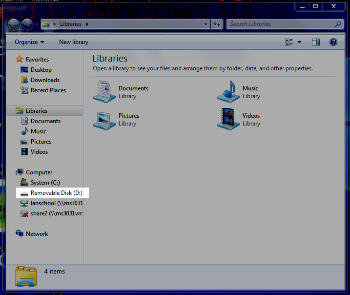 2. In Windows Explorer, locate your flash drive and right-click it (two-finger tap on a track pad).  3. From the flyout menu, select Rename.   4. In the dialogue box, rename the flash drive with your first and last name (or first initial and last name if your full first and last names don't fit). 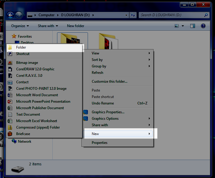 5. Click on your flash drive. In the area to the right, where it shows what's on your drive, right-click (or two-finger click on a track pad) in an open area (not on any existing files) and select New and then Folder from the flyout menus. NAME THAT FOLDER DIGITAL ART PROJECTS. 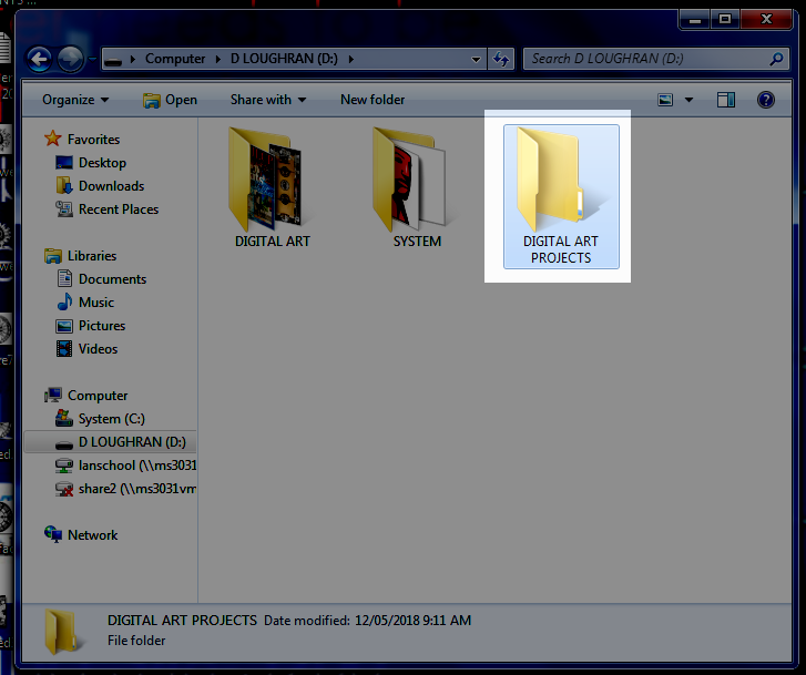 6. Open the new Digital Art Projects folder. 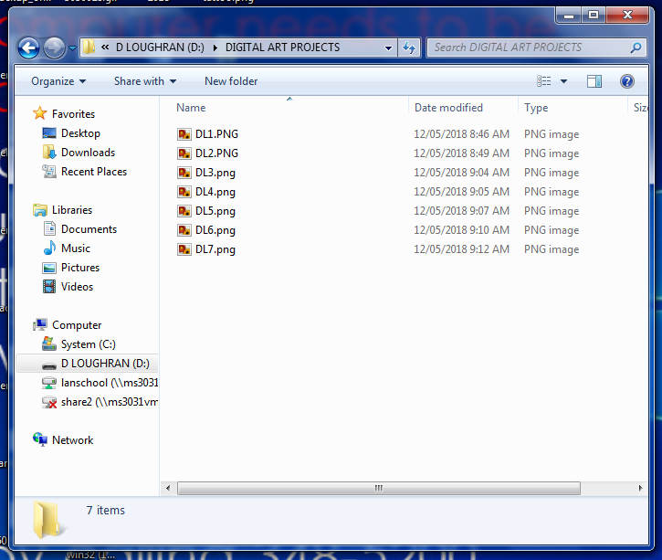 7. Save all of your assignments in this folder. Each assignment file must be named with your first initial, last initial and the number of the assignment as shown above.
The first, last and only commandment for the process of having your work graded is: I. THOU SHALT FOLLOW THE ABOVE DIRECTIONS EXACTLY Your work absolutely will not be graded if you do not. So sayeth the teacher, so sayeth the choir. Create a word document to complete the quiz below.
Visual Arts Terms and Definitions Quiz Directions: On a sheet of lined or unlined paper, write (by hand) the questions/statements below, filling in the blanks using the correct term from the list of terms below. 1. is a Balance achieved through the use of unequal parts or Elements. (For example: imagine a beach ball by the side of a stick and two baseballs on the other side balancing out the picture.) 2. is a Principle of Art and Design concerned with the arrangement of one or more elements in a work of art so that they appear symmetrical (identical compositional units on either side of an axis) or asymmetrical (not identical) in design and proportion. 3. is an Element of Art derived from reflected light. The sensation of color is aroused in the brain by response of the eyes to different wavelengths of light. Color has three properties: hue, value, and intensity. 4. is the arrangement of forms in a work of art. 5. is a work of art is usually discussed in terms of its subject matter, form and content. Content refers to the intellectual, psychological, spiritual, narrative or aesthetic aspect of the work. 6. is an outline that shows only the edge and not the volume or mass of an object. Sometimes called blind contour if the artists in not looking at their paper, only at their subject. 7. is the use of opposites near or beside one another (light and dark, rough and smooth). 8. describes colors like green, blue and violet (purple). 9. is the difference in importance of one aspect in relation to all other aspects of design. What stands out most in a work of art. 10. is a Principle of Art and Design concerned that stresses one element or area in a work of art to make it attract the viewer’s attention first. 11. is increasing or enlarging an object or figure or one of its parts to communicate ideas and feelings. 12. is a Government program established during the Depression to create jobs for American artists. 13. is the center of interest of an artwork; the part you look at first. 14. is an artist uses form as a vehicle for rendering a particular type of subject matter. The formal elements of a work consist of the groupings and combinations of shapes. 15. is made of pigments ground in water and mixed with gum to form opaque watercolor. Gouache resembles school tempera paint or poster paint. 16. is a the name of a color – red blue, yellow, etc. 17. is the brightness of a color. 18. is an identifiable path of a point moving in space. It can vary in width, direction, and length. Horizontal lines tend to create a sense of calm in a picture. Vertical lines tend to create a feeling of stability. Diagonal lines tend to create a feeling of dynamic movement. 19. is the specific material used by an artist, such as oil and brush; also, the vehicle used, such as sculpture, painting or photography. 20. is a unit repeated in visual Rhythm. Units in a motif may or may not be an exact duplicate of the first unit. 21. is a two-dimensional decorative visual repetition. A pattern has no movement and may or may not have rhythm. 22. is the illusion of Space, whether three- or two-dimensional, created by an artist on the two-dimensional surface of the canvas or paper. 23. is a Principle of Art and Design concerned with the size relationships of one part to the whole and one part to another. 24. is a Principle of Art and Design that repeats elements to create the illusion of movement. Visual rhythm is perceived through the eyes, and is created by repeating positive spaces separated by negative spaces. Alternating rhythm is when the visual rhythm set up by repeating motifs but changing position or content of motifs or spaces between them. Flowing rhythm is created by repetition of wavy lines. Progressive rhythm is a visual rhythm that changes a motif each time it is repeated. Random rhythm is a repetition in no apparent order with no regular spaces. Regular rhythm is achieved through repeating identical motifs using the same intervals of space between them. 25. is a printing technique that makes use of a squeegee to force ink directly onto a piece of paper or canvas through a stencil containing the image. (The process is also called silk-screen or serigraphy.) 26. is the dark Values of a color (adding black). 27. describes any two-dimensional area defined by line or a change in color, value or texture. Geometric Shapes look as though they were made with a straight edge or drawing tool; square, circle, triangle and oval. Organic shapes are also called free form. These shapes are not regular or even. Their edges are curved and angular or a combination of both. 28. refers to emptiness or areas between, around, above, below or within objects. 29. is the topic of interest or the primary theme of an artwork. 30. refers to the way things feel or look as though they might feel if they were touched. 31. is a term used to describe light values of a color (adding white) 32. is the arrangement of one or more of the Elements of Art and Design used to create a feeling of completeness. Everything in the work seems to belong and contribute to the overall picture. 33. is a term that describes light or dark; the variations of light and dark on the surface of an object. The lightness or darkness of a color. 34. is a Principle of Art and Design concerned with difference or contrast. 35. describes colors like red, orange and yellow. TERMS Asymmetrical Warm colors Pattern Balance Tint Texture Unity Rhythm Screen print Pictorial space Proportion Shade Emphasis Composition Shape Exaggeration Value Color Subject matter Intensity Content Contour drawing Medium Line Motif Form Cool colors Focal point Hue Contrast Variety Federal Arts Project Dominance Gouache Space ASSIGNMENTS 10 and 11 are due for grading, on flash drives, NO LATER THAN Thursday, December 6th. Please make sure that you have properly formatted your flash drive, created the Digital Art Projects folder and titled your project files correctly. Once again, the work will not be graded if those things are not done properly.
I will need to keep your flash drives for several days. So please make arrangements to use your second flash drive or other method for saving your work in class until Tuesday, December 11th. |
AuthorDaniel P. Loughran is an artist and art educator who lives in Jacksonville Beach, Florida. Archives
September 2020
Categories |
 RSS Feed
