|
Compare the two posters below. Same design, same information. But obviously the text on the second is done differently. 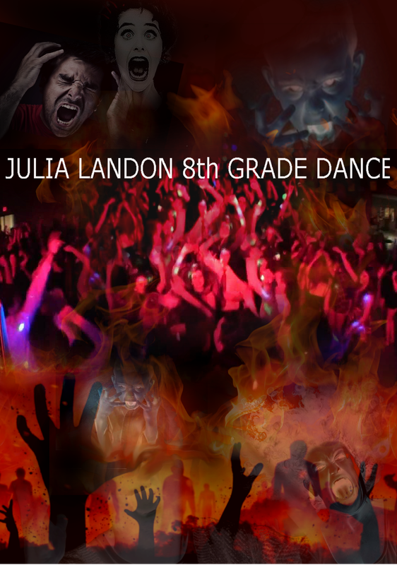 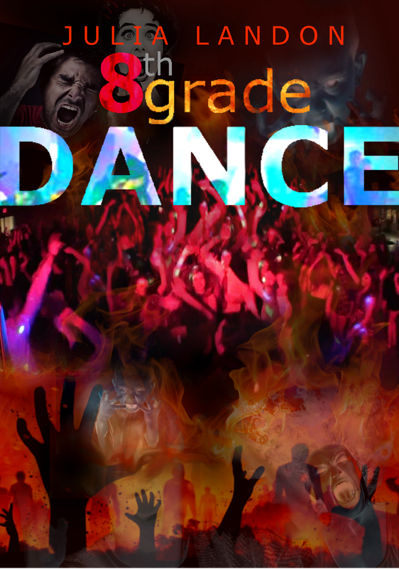 Both posters use Verdana as the font. But notice the differences:
1. COLOR 2. UPPERCASE and LOWERCASE 3. SIZE 4. HOW MUCH THE LETTERS/WORDS STAND OUT FROM THE BACKGROUND 5. NORMAL and BOLD Of all the questions of WHO, WHAT, WHERE and WHEN, the most important, BY FAR, is WHAT. So that is the part that needs to be biggest and boldest Anyone reading the second poster sees "DANCE" first. That's how you as the designer have gotten their attention. They then learn WHO and WHERE. If they love dances, they will want to know the rest of the information. If they don't love dances, they're not going anyway. Comments are closed.
|
AuthorDaniel P. Loughran is an artist and art educator who lives in Jacksonville Beach, Florida. Archives
September 2020
Categories |
 RSS Feed
