Check out the way the text in the posters below.Then read the stuff below them.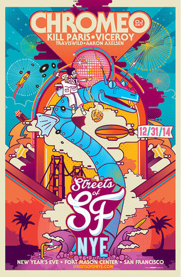 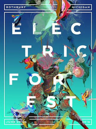  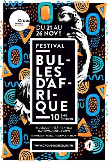 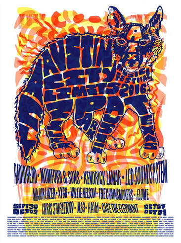  Doing text well is one of the hardest parts of graphic design. Some designers are brilliant at it... often creating entire designs out of nothing but letters and words. Below is a list of general rules for doing text well in your graphic designs: 1. Do not use the "auto return" (pressing ENTER to move down to the next line of text" when typing. 2. Use only one or two fonts in you design. If you need more than that, use different STYLES of the same font(s). 3. Avoid the following fonts (They are either boring, unattractive or have been overused to DEATH... or maybe all three!):  4. Don't make all of the text the same size. The most important part, what you are advertising, should be NOTICEABLY larger than any other text in your design.
5. And finally, make sure the text FITS IN with the other stuff in your design. The entire thing should look like it all GOES TOGETHER. Choose colors, textures, etc. for your text that are similar to those in your art (the pictures). Comments are closed.
|
AuthorDaniel P. Loughran is an artist and art educator who lives in Jacksonville Beach, Florida. Archives
September 2020
Categories |
 RSS Feed
