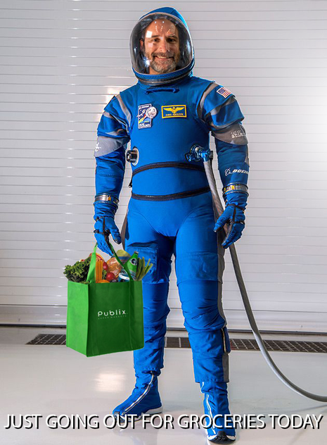
 Create a meme that is a self-portrait (you creating a picture of yourself... sorry, there's often a little confusion about that) showing how life has changed as a result of Covid-19. Use a background image and at least three other images (words do not count). Have fun with this one.
If you have no images of yourself to use already, try either using your phone and emailing the image to yourself or using the camera on your computer. 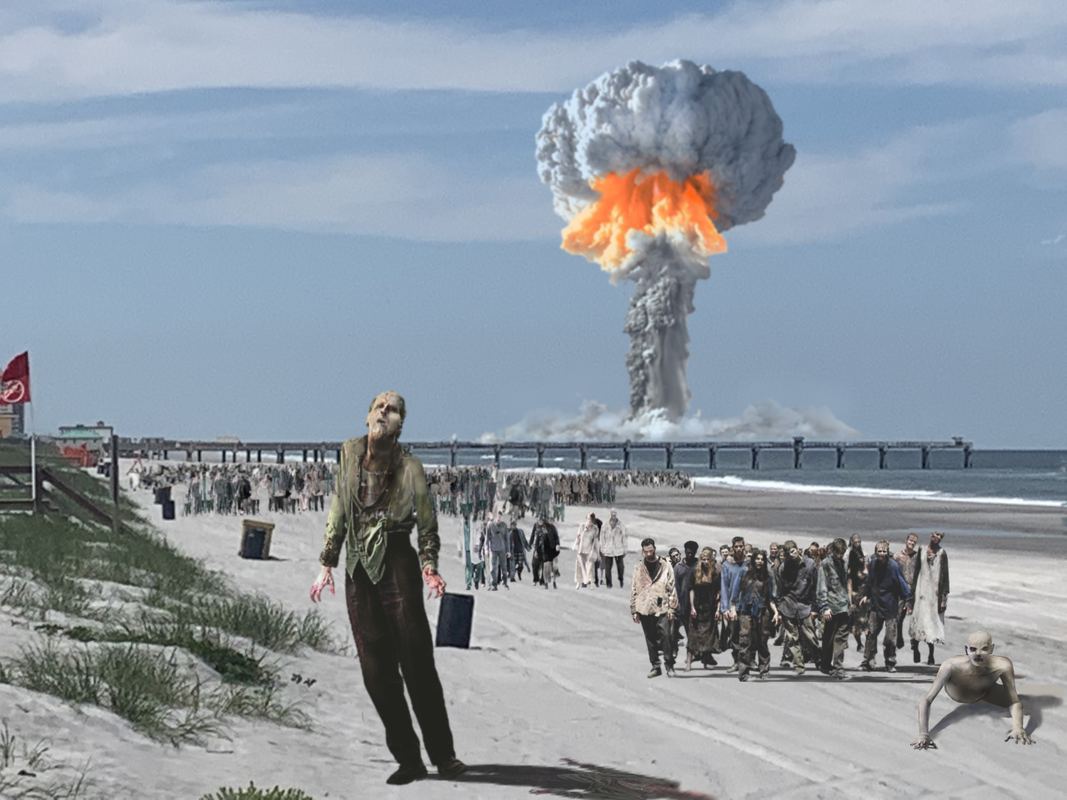 OK, keep in mind that this theme is all about having some fun. One of the ways we can deal with really frightening or difficult things is to make fun of them.
Any good idea for this thing could start with "Today, during quarantine, I decided to get out of the house and take a walk. Now I know what's really going on out there..." This will be another project in which we practice some skillful photo compositing/editing. In Pixlr (or any other raster photo editing program... if you've had trouble with Pixlr lately try searching something like "free online photo editing software" or "online raster editor" or "open source photo editing program"), create an original image that depicts/shows your imaginative idea of what the REAL apocalypse would look like. Please do the following: 1. Select an image to serve as your background that is recognizable as Jacksonville (here I used a photo that I took of Jax Beach with the pier in the background) 2. Add to the background at least twenty (20) other images to create your fictitious end of the world scene. 3. Try to make your idea entertaining, funny, unusual or in some other way very creative. 4. Your work will be graded based upon the creativity of your idea and the quality of your photo editing. Don't forget about things like shadows and highlights, reflections and other lighting effects. 5. Your work is due by the end of the day Friday, April 17. I am currently trying to figure out a better way for you guys to send me your work. I'll let everyone know by Wednesday what I discover. So don't send me any work until then please. 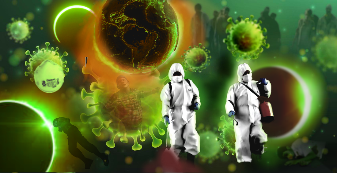 In Pixlr Editor, create an original composition using at least 20 separate images you find online. Your background image will count as one of them. The subject of your digital art composition will be your thoughts and feelings regarding Covid 19/the Coronavirus. The thoughts and feelings you express through this work only need to make sense to you. Don't worry about whether or not it will make sense to anyone else. Make your composition at least 1000 pixels on the short side, more on the longer side. You will be graded on creativity, originality and the amount of work and effort you put into your work. Directions on how to submit your work for grading will be coming soon. As always, do good work. Assignment #18 "Get Out the Vote" Digital Art 1 Assignment #8 "Get Out the Vote 2" Digital Art 23/5/2020
 DIGITAL ART 1 STUDENTS:
In a 2500 px (width) x 3300 px (height) image, design a funny/attention-getting campaign poster for the political position of your choice. That position could be anything from Class President to President of the United States. The candidate may be you or someone else. If you yourself are the candidate, you can use a picture of yourself (if you can get one) or a picture of someone else (a pretend you) or use no picture at all. Your choice. But just be creative and have fun with it. Think about the overall layout, how well you use up the space and the colors you use specifically. This should be our last project of the third quarter. Use Pixlr for all of you photo stuff. Use Inkscape to do all of your text. DIGITAL ART 2 STUDENTS: You are to create a similar poster but for ONE OF THE ACTUAL CURRENT PRESIDENTIAL CANDIDATES. A number of candidates on the Democratic side have dropped out of the race recently. So feel free to use any of the candidates from, say, a month ago. STEP 1: DRAW THE FRAMES' BORDERS IN INKSCAPE  STEP 2: FIND INDIVIDUAL IMAGES ONLINE THAT WILL BE THE THINGS IN THE PANEL.
    STEP 3: ARRANGE THE OBJECTS IN YOUR FRAME TO CREATE YOUR PANEL.  STEP 4: COLOR IT.  Words you gotta know: 1. Sequential Art: Any drawing, painting or computer art that tells a story using a series of "scenes". A comic strip is an example of sequential art. 2. Black Line Drawing: A drawing composed only of outlines, no "fill" colors, including black. 3. Story Board: A sequence of drawings, usually with narration or "word bubbles" (the bubbles in a comic strip that contain words that are said or thought by the characters), representing the shots planned for a movie or television production. 4. Organic Object: Anything that is alive or was once alive or was created in nature. Examples include people, trees, birds, clouds, etc. 5. Mechanical Object: Anything created, made or built by humans that is not alive. Examples include cars, buildings, computers, etc. So, if you understand the above terms, you ought to be able to understand this statement: "The story board below is an example of sequential art. It has both organic and mechanical objects in it and probably began as a black line drawing." 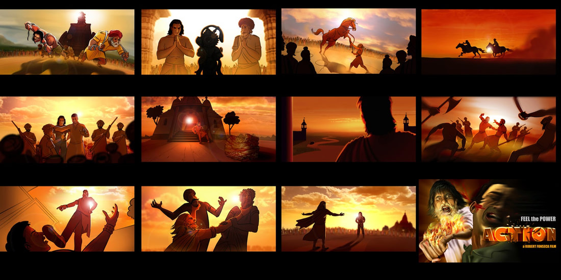  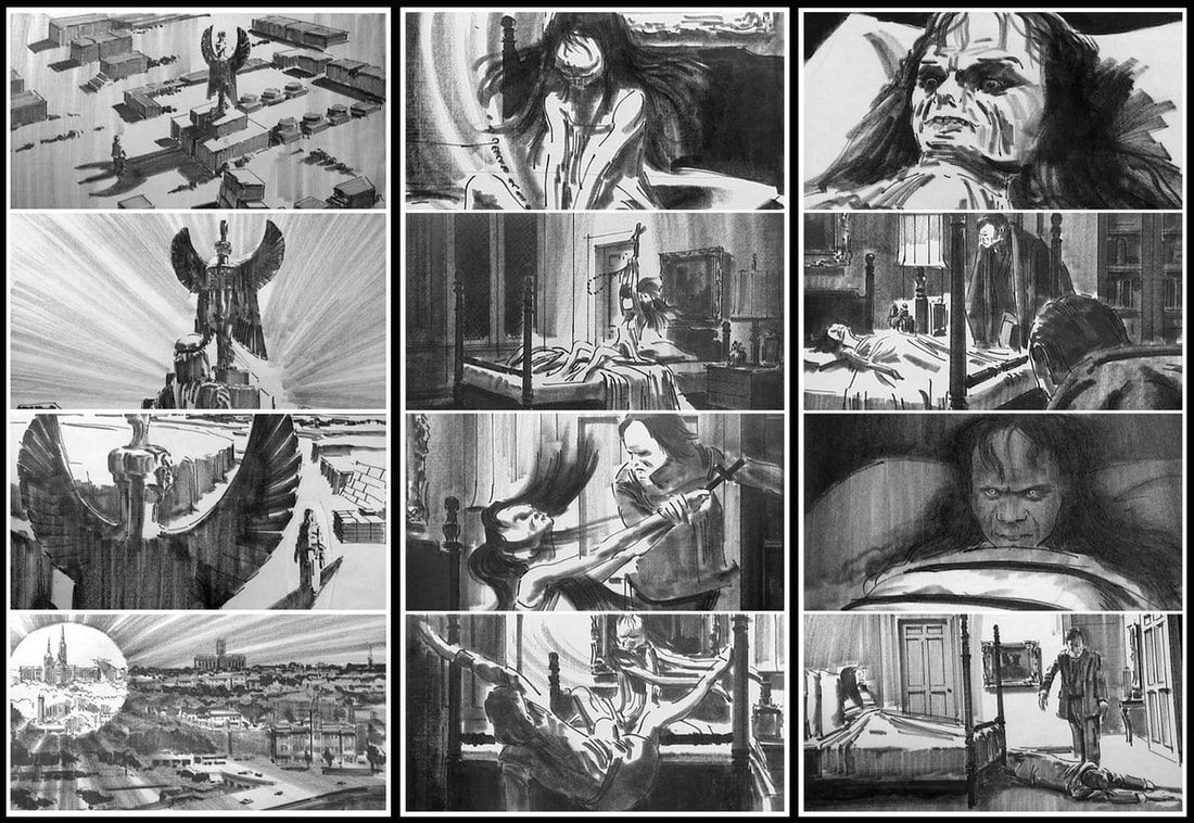 BEFORE I EVEN BEGIN telling you about this assignment, there's something REALLY important you need to make sure you do. You are going to have to use a lot of images you find online. Use them in your story board. Edit them in any way you need to. Color them. Whatever.
BUT, also save ALL of the images in their UNEDITED form, just like you found them online, in a separate folder named "LINE ART" and place that folder AND your finished project in a folder named "STORY BOARD" on the class flash drive. I will look at those images as well as your finished Story Board when I'm grading. Your assignment is to create a story board. In a series of blank boxes (your "panels" or "scenes") that you draw in INKSCAPE, create your own Story Board as follows: Create an original narrative (story). The narrative can be a story about anything... about you, someone else, something funny, something serious, something completely made up or it can be a true story. Your Story Board shall be created to meet the following criteria: 1 It is at least 1000 px in both width and height. It can be larger than that. 2 It contains a minimum of ten (10) panels or scenes. 3 It illustrates your narrative in chronological order (first something happens, then another thing happens and so on). 4 EACH of the panels contains the following: - iT CONTAINS AT LEAST two organic objects and two mechanical objects. For example, a person, a tree, a car and a building. - It is FULLY-COLORED including the use of GRADIENTS in EVERY PANEL/SCENE. - It contains words of some kind. These words can be put in there lots of different ways. You can use "word bubbles". There can be a little narration written across the bottom or top of each frame. The words can even be something written on the side of a wall or on a billboard or something. Use BLACK LINE DRAWINGS that you find online, meaning that you find drawings of the things you want to put in your storyboard that are just the outline. You will put them all together and color them yourself in PIXLR. Oh, and have fun and be creative with this thing :-) Create a Word document to complete the quiz below.
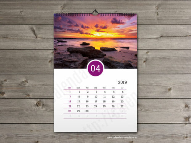
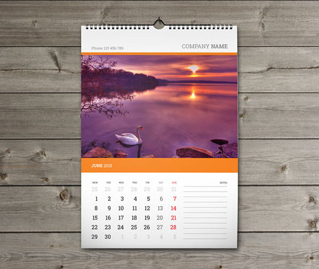
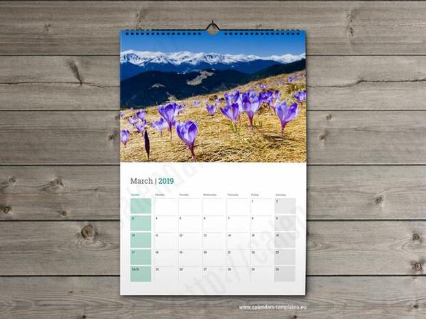
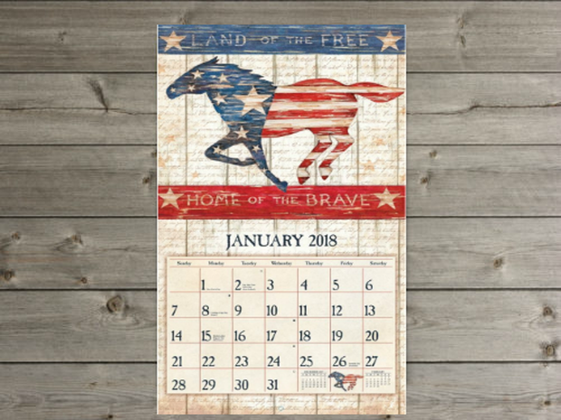
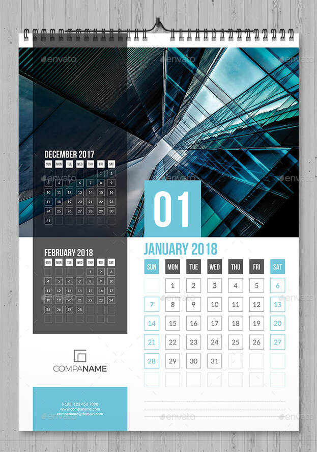
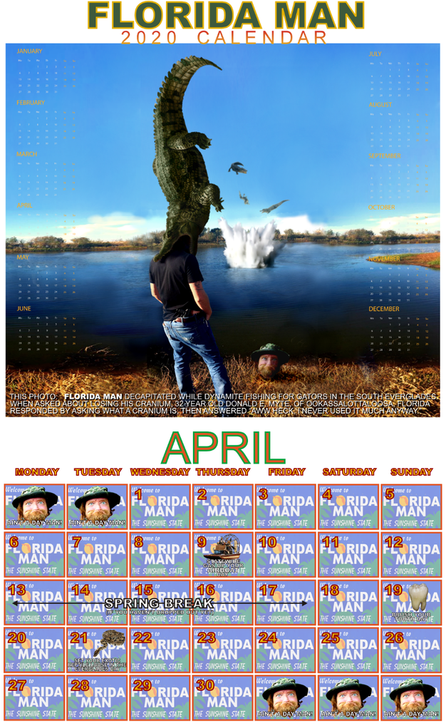
Visual Arts Terms and Definitions Quiz Directions: Type the questions/statements below, filling in the blanks using the correct term from the list of terms below. Make sure to underline your answer. 1. is a Balance achieved through the use of unequal parts or Elements. (For example: imagine a beach ball by the side of a stick and two baseballs on the other side balancing out the picture.) 2. is a Principle of Art and Design concerned with the arrangement of one or more elements in a work of art so that they appear symmetrical (identical compositional units on either side of an axis) or asymmetrical (not identical) in design and proportion. 3. is an Element of Art derived from reflected light. The sensation of color is aroused in the brain by response of the eyes to different wavelengths of light. Color has three properties: hue, value, and intensity. 4. is the arrangement of forms in a work of art. 5. is a work of art is usually discussed in terms of its subject matter, form and content. Content refers to the intellectual, psychological, spiritual, narrative or aesthetic aspect of the work. 6. is an outline that shows only the edge and not the volume or mass of an object. Sometimes called blind contour if the artists in not looking at their paper, only at their subject. 7. is the use of opposites near or beside one another (light and dark, rough and smooth). 8. describes colors like green, blue and violet (purple). 9. is the difference in importance of one aspect in relation to all other aspects of design. What stands out most in a work of art. 10. is a Principle of Art and Design concerned that stresses one element or area in a work of art to make it attract the viewer’s attention first. 11. is increasing or enlarging an object or figure or one of its parts to communicate ideas and feelings. 12. is a Government program established during the Depression to create jobs for American artists. 13. is the center of interest of an artwork; the part you look at first. 14. is an artist uses form as a vehicle for rendering a particular type of subject matter. The formal elements of a work consist of the groupings and combinations of shapes. 15. is made of pigments ground in water and mixed with gum to form opaque watercolor. Gouache resembles school tempera paint or poster paint. 16. is a the name of a color – red blue, yellow, etc. 17. is the brightness of a color. 18. is an identifiable path of a point moving in space. It can vary in width, direction, and length. Horizontal lines tend to create a sense of calm in a picture. Vertical lines tend to create a feeling of stability. Diagonal lines tend to create a feeling of dynamic movement. 19. is the specific material used by an artist, such as oil and brush; also, the vehicle used, such as sculpture, painting or photography. 20. is a unit repeated in visual Rhythm. Units in a motif may or may not be an exact duplicate of the first unit. 21. is a two-dimensional decorative visual repetition. A pattern has no movement and may or may not have rhythm. 22. is the illusion of Space, whether three- or two-dimensional, created by an artist on the two-dimensional surface of the canvas or paper. 23. is a Principle of Art and Design concerned with the size relationships of one part to the whole and one part to another. 24. is a Principle of Art and Design that repeats elements to create the illusion of movement. Visual rhythm is perceived through the eyes, and is created by repeating positive spaces separated by negative spaces. Alternating rhythm is when the visual rhythm set up by repeating motifs but changing position or content of motifs or spaces between them. Flowing rhythm is created by repetition of wavy lines. Progressive rhythm is a visual rhythm that changes a motif each time it is repeated. Random rhythm is a repetition in no apparent order with no regular spaces. Regular rhythm is achieved through repeating identical motifs using the same intervals of space between them. 25. is a printing technique that makes use of a squeegee to force ink directly onto a piece of paper or canvas through a stencil containing the image. (The process is also called silk-screen or serigraphy.) 26. is the dark Values of a color (adding black). 27. describes any two-dimensional area defined by line or a change in color, value or texture. Geometric Shapes look as though they were made with a straight edge or drawing tool; square, circle, triangle and oval. Organic shapes are also called free form. These shapes are not regular or even. Their edges are curved and angular or a combination of both. 28. refers to emptiness or areas between, around, above, below or within objects. 29. is the topic of interest or the primary theme of an artwork. 30. refers to the way things feel or look as though they might feel if they were touched. 31. is a term used to describe light values of a color (adding white) 32. is the arrangement of one or more of the Elements of Art and Design used to create a feeling of completeness. Everything in the work seems to belong and contribute to the overall picture. 33. is a term that describes light or dark; the variations of light and dark on the surface of an object. The lightness or darkness of a color. 34. is a Principle of Art and Design concerned with difference or contrast. 35. describes colors like red, orange and yellow. TERMS Asymmetrical Warm colors Pattern Balance Tint Texture Unity Rhythm Screen print Pictorial space Proportion Shade Emphasis Composition Shape Exaggeration Value Color Subject matter Intensity Content Contour drawing Medium Line Motif Form Cool colors Focal point Hue Contrast Variety Federal Arts Project Dominance Gouache Space 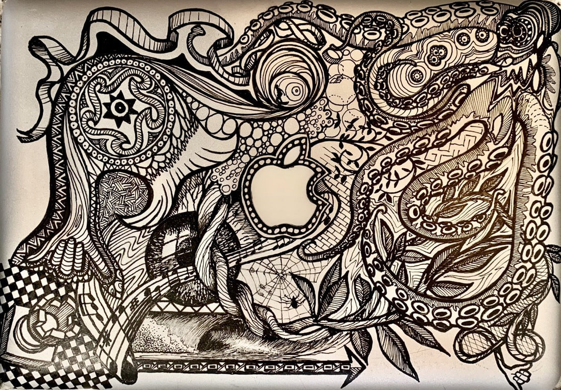 SERIOUSLY, don't freak out. There's no due date yet on this, but I'll give plenty of time to finish it. ASSIGNMENT: (You can work on this assignment or Assignment #15 today.) THE IMAGE ABOVE is a design I drew on the cover of one of my laptops. Just for fun; and because we as graphic artists decorate things. SO, on one of the two pictures below (depending on whether you're a Mac or Windows person), make a design for the top of the "cover". Your are to decorate it using 10 or more images you find online to put together to create an interesting design (so you don't have to be a super-killer-awesome-drawer-artist kid) . You can right-click either image to get the option to "Save As" USE ANY IMAGES YOU WANT EXCEPT REAL-LIFE PHOTOS. YOU CAN USE cartoons, video game characters, logos, designs that are just shapes and colors; OR just about anything else... just no actual real-life photos of real life things. I will grade them and judge which one is best based on appearance, the care with which the student put the design together, etc. THE WINNER WILL RECEIVE THE FOLLOWING PRIZE (IF HE OR SHE WANTS IT... SEEMS THAT A LOT OF PEOPLE THOUGHT THE ONE I DID WAS COOL): On the laptop, tablet, phone or other personal electronic device or on the device's case, I will draw the design that he or she made for this assignment using paint pens in the same way I drew mine in the example above. BTW, if you win, you don't have to do it... in case you don't want your devices or their cases drawn on.    ASSIGNMENT: Design the two pages for a month in a calendar based on a theme of your choice. Choose a theme that you think is funny or weird or interesting in some way.
You will design two pages, a top page containing the image or images you create and a bottom page showing the days and dates. These have to be ENTIRELY ORIGINAL. Do not edit or alter existing calendar pages or use any online templates. Create the first (top) page in Pixlr, making the image or images as interesting as possible. Save that work as a .PNG file and import it into Inkscape to do the rest of the layout. The Pixlr page can be any size you like, somewhere around 1800 px (width) x 1200 px (height) works well. Use the real days and dates of the month in 2020 that you choose. When you create the second (bottom) page in Inkscape, remember how you've drawn lines and boxes, written text and used the DUPLICATE or COPY AND PASTE functions. Use colors in your pages that go well together. Choose fonts that you think are interesting. The size of the "box" (the page) that you get automatically in Inkscape (8.5 in x 11 in) is the size to use for the final layout. That's the image you will turn in for grading and IT MUST BE SAVED AS AN .SVG FILE! |
AuthorDaniel P. Loughran is an artist and art educator who lives in Jacksonville Beach, Florida. Archives
September 2020
Categories |
 RSS Feed
